


As the Lead User Experience Designer, it was my job to build and lead the UX/UI team to shipping a 95 Metacritic Game. My involvement went far beyond simply putting UI in the game.
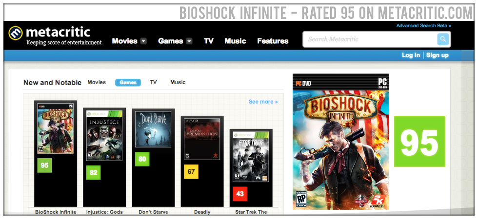
Not all games have the honor of seeing a 95 Metacritic.com Rating. That's a pretty powerful statement about the work itself. Not everyone loved it, but those that did - LOVED IT!
We've won many of the industries highest accolades, 80 or so before our product even hit the shelves. This speaks to both the industry and the fans love of our work.
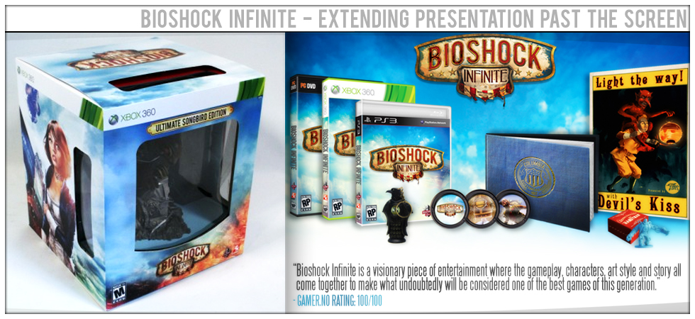
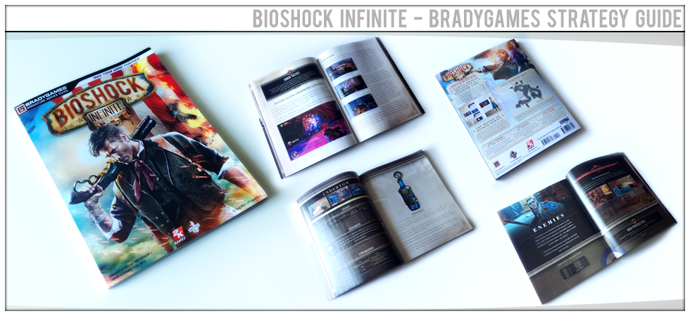
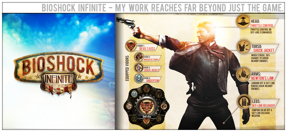
My work and its direct influence can be seen across the entire product spectrum ranging from the packaged good itself to the secondary products that come from the Bioshock Brand.
The shapes, colors and forms that I established for the game interface have continued to influence the visual presentation of the user experience both on and off the console.
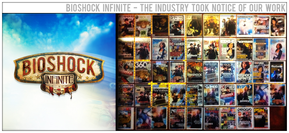
There have been so many articles and magazine covers that we started hanging them up because it was amazing to see. I also had direct involvement in the design and development of several cover images.
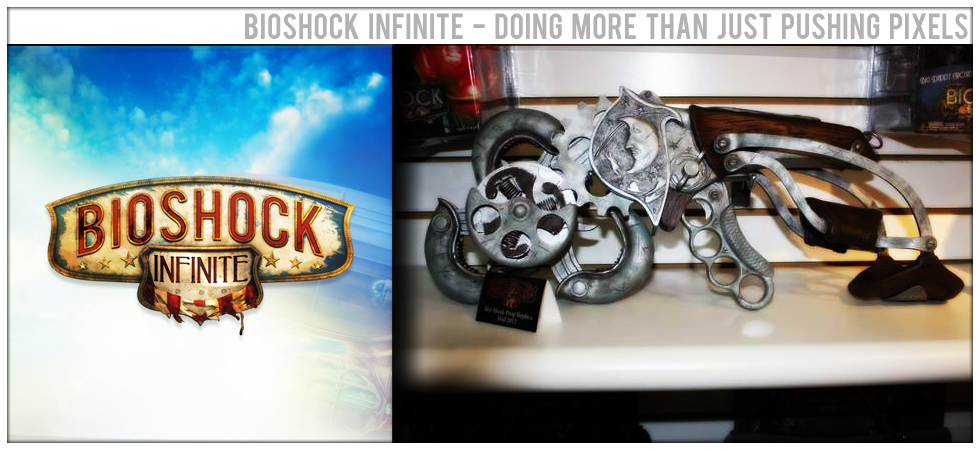
My involvement in the Bioshock brand is far more than just pushing pixels. I've been a part of the teams that have designed and built secondary products that bear the brand as well.
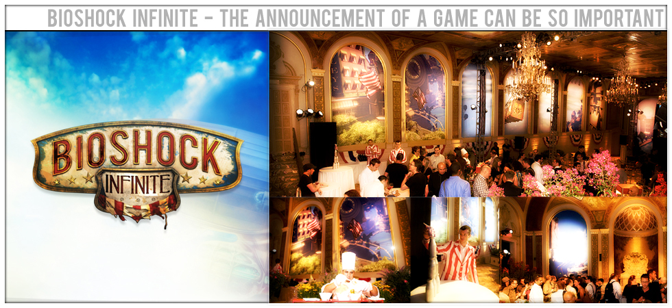
The announcement of a game can be as critical as the release of a game, events like this require design and art direction. I did both for this high-profile New York Announcement event.
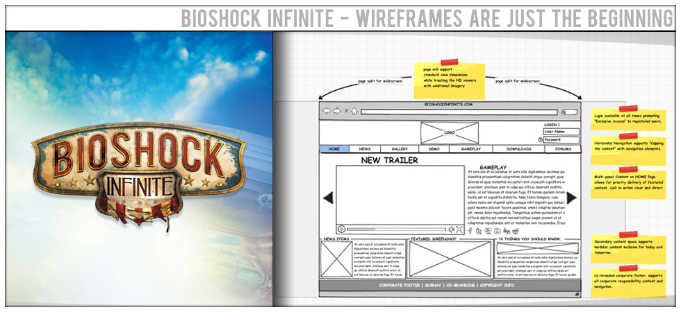
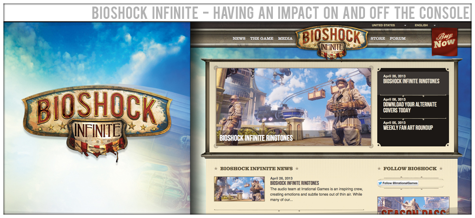
In addition to the game interface I also provided UX/UI direction and support to the teams responsible for our Primary Launch Site as well as Versions 1 & 2 of BioshockInfinite.com
In addition to the game interface I also provided UX/UI direction and support to the teams responsible for our Primary Launch Site as well as Versions 1 & 2 of BioshockInfinite.com
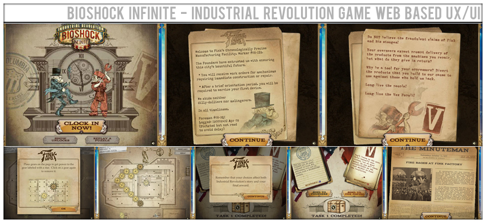
Building and launching a Flash based micro game for a AAA level game is a tall order. It needs UX/UI/Branding/Creative and Art Direction. I really enjoyed being a part of this project.
Defining user flows, user tasking and user feedback through elegantly crafted visuals ensure that the end result is both enjoyed and playable by a wide demographic across the web.
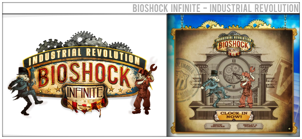
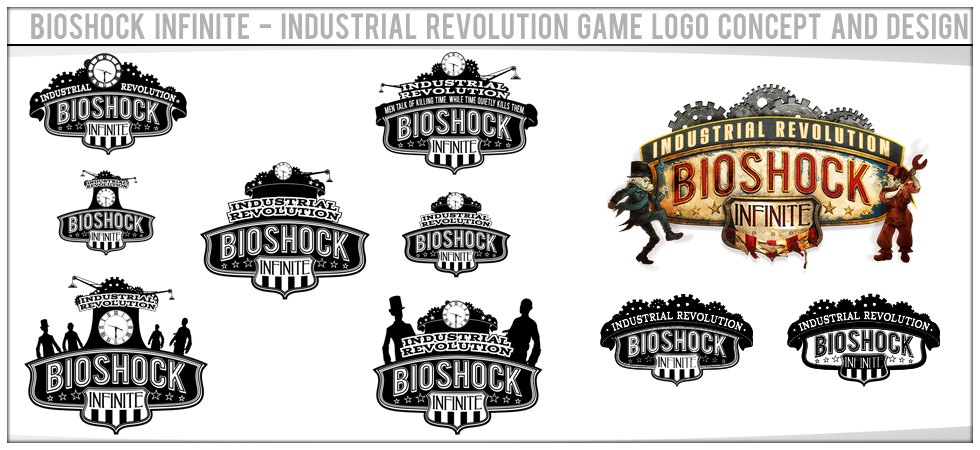
As a part of the team that crafted and launched Industrial Revolution, I was able to start the logo concept process that resulted in the finished logo.
Fan services and fan strategy is an important part of game development. Giving them things to hold onto while we finish the game can go along way to keeping them engaged in the brand.
All of this and I've not shown the game UX/UI yet. My work tends to reach far beyond the game, ensuring that the users are always engaged in a consistent brand experience.
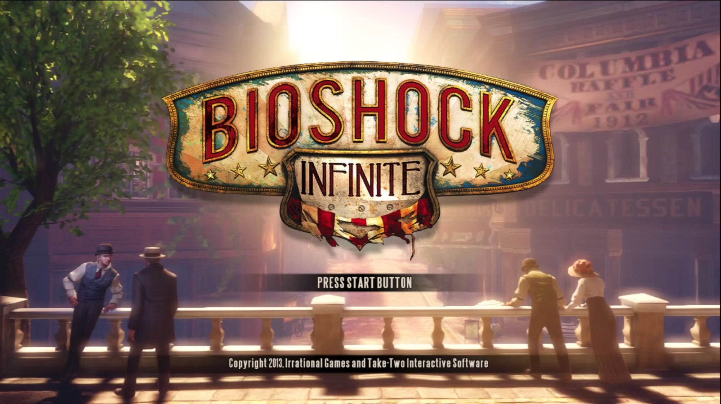
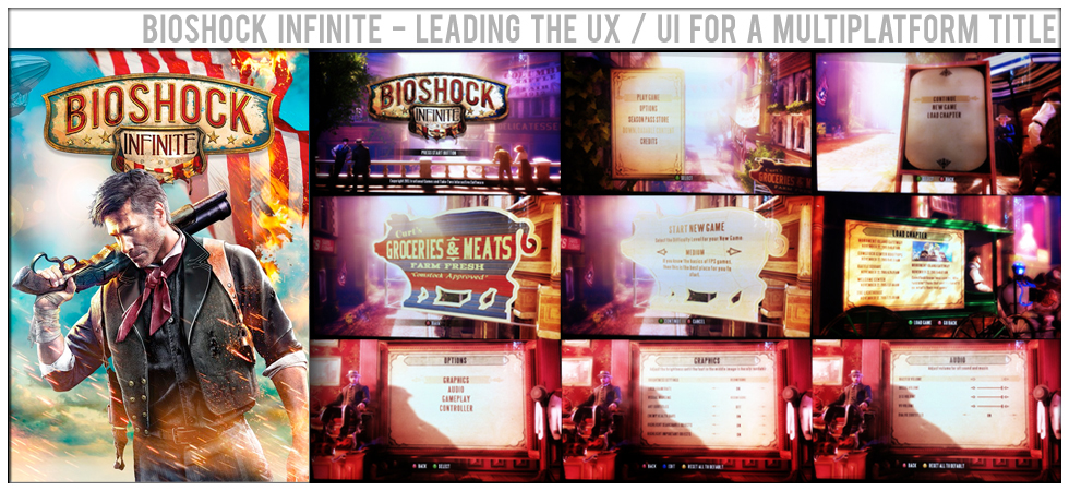
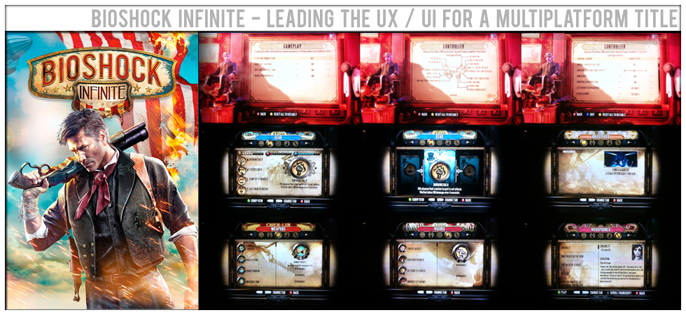
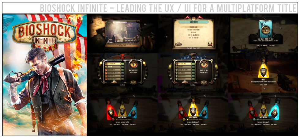
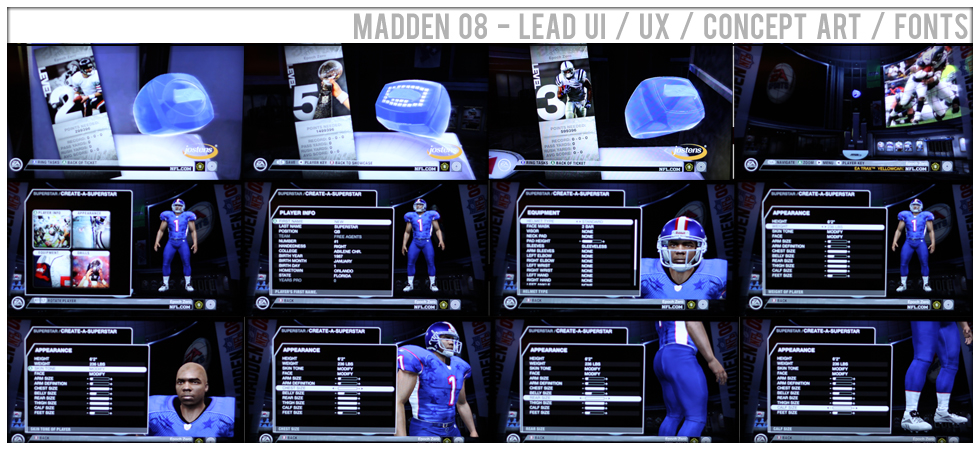
A fully immersive 3D main menu - one of the things I am most proud about on this title. It takes the user from outside the experience, directly into the game.
Stills of each of the main menu screens as you move throughout the game configuration and start process. The experience was driven via a camera on rails system that was custom built for this menu experience.
Settings screens and in-game screens - the vending machines
More in game screens - HUDs, pause menu, gear pick up screens and more vending machine screens.
I have been fortunate enough to have contributed to the successful completion of over 20 AAA games in many roles with a myriad of responsibilities. Shipping on all platforms - Xbox360 / PS3 / PSP / DS / Mobile and Web.
I led a team of 12 brilliant people through many hardships and successes to get this title pulled together and out the door. We blazed new paths in technology and process in the studio. Xbox 360 / PS3 / PC / Iphone.
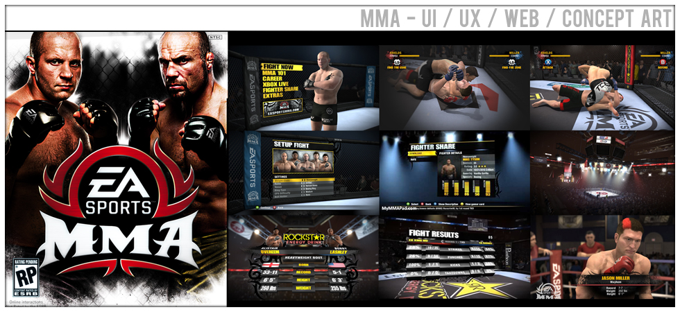
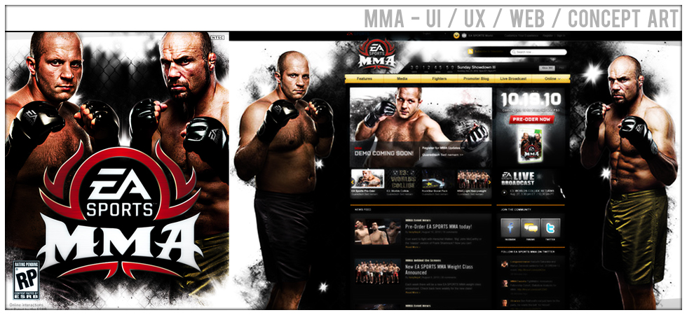
In addition to the game itself I was a key member of the development team that crafted the launch site and web platform from an interface and user experience standpoint.
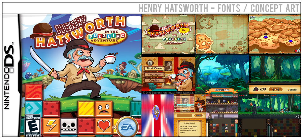
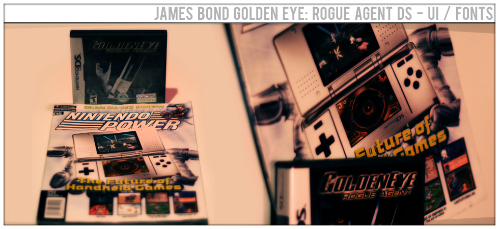
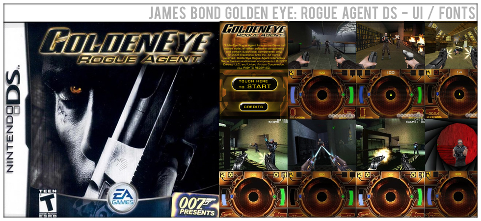
I supported the design and development of this awesome DS puzzler with custom design fonts and helped with concept during the pre-production phase of the project.
I was brought onto this project to help overcome communication and design challenges and get the project done. I was able to support that process while mentoring jr. staff members and growing studio talent.
This project was facing some tough design challenges. We concepted, prototyped and shipped innovative solutions that proved to be fundamental to the success of the title.
This included both design language development and user facing feature design for back of the box feature sets.
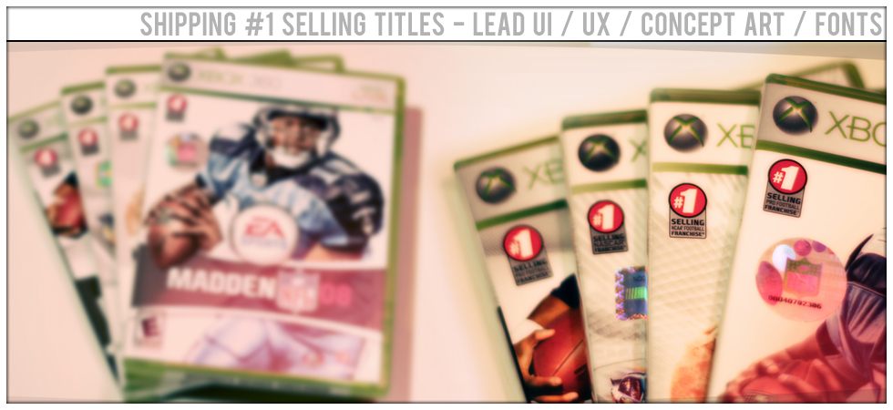
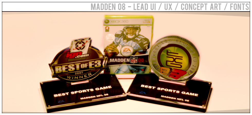
When the products you ship have #1 on the box it means something. Usually something that's earned. Year over Year EA Sports' games continue to define sports gaming on the console and contributing to those brands is an honor.
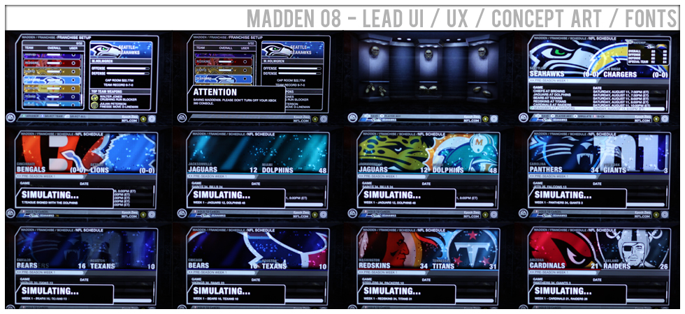
I lead a team of over 35 people to ship this award winning game. Overcoming design complications and challenges, we still hit the mark and did so while continuing to grow the value of the Madden Franchise.
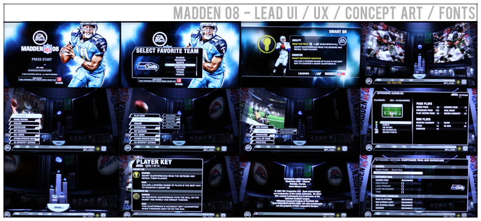
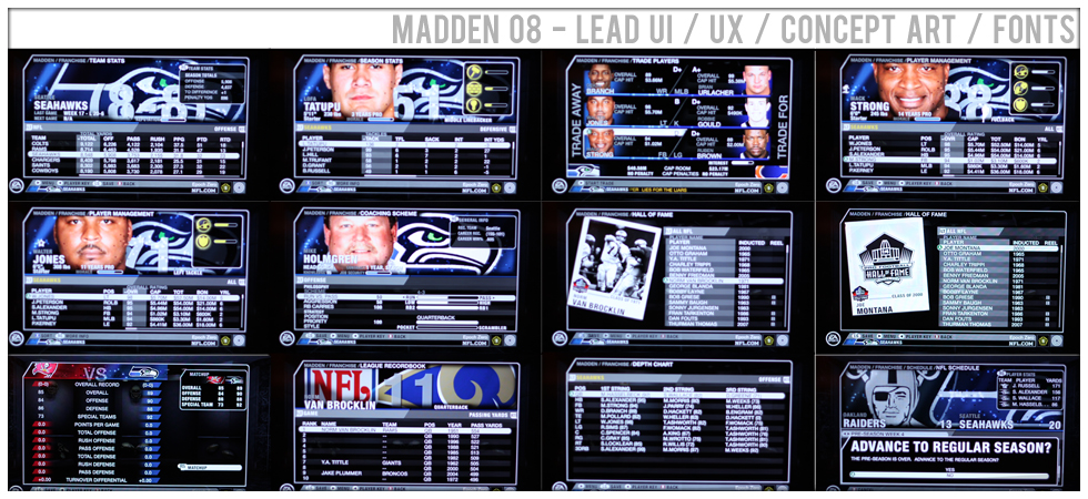
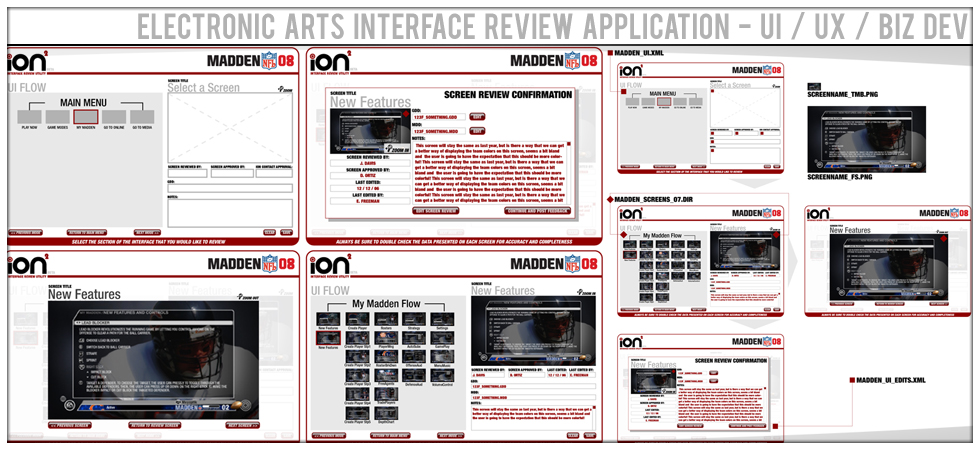
We developed many unique features in this edition of the game. With several hundred screens in the game and a great deal of the user experience happening in screens it's a huge undertaking.
Leveraging a clearly defined design language and solid foundation we were able to successfully get the game done in the tight time frame dictated by a yearly title.
I designed style guides, wireframes, user flows and feature sets. All designed to enhance and engage every Madden player in the world.
It's a small group of people that can say their work has been in the hands of millions and millions of players. I am one of the fortunate few. Leading the team to get it done was amazing!
This project was the foundation for what became the global EA Sports Interface design language that rolled out to all EA Sports Games. I was a critical designer in that process and co-crafted these standards with my team.
This game taught me exactly how much work can get cut out of a project to get it on the shelf. My contributions to the game that made it to the shelf include HUD Design, iconography, custom fonts and interface design solutions.
It would seem that others loved the solution as well, it was featured on the cover of Nintendo Power Magazine for an article titled "The Future of Games!"
I lead the design of the HUD and Game interface and worked with the external partner in the production of the final solution. The DS presented significant challenges to me as a designer, I loved it!
I designed an internal application that significantly streamlined the design, review, feedback and check-off phases of screens for the project. These process innovations introduce significant savings on project costs.
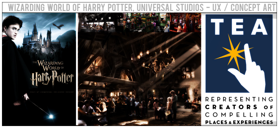
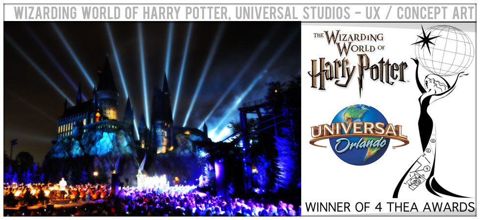
I was part of the team that brough the amazing Wizarding World of Harry Potter to life for Universal Studios.
My credited contributions to this project helped them win 4 THEA awards. Awards aside, being a part of the team that brought this brand to the real world was just an awesome experience!
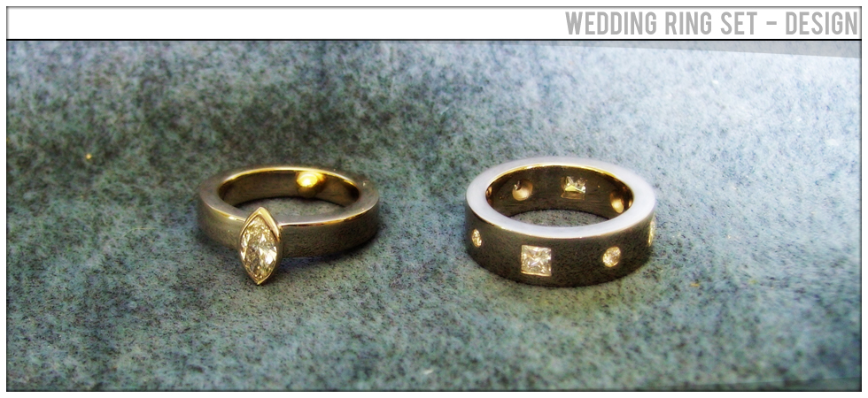
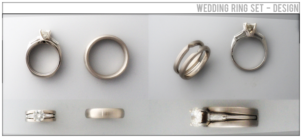
To be able to design the rings that reflect on the commitment of ones life to another is one of the greatest honors a designer can ever have. This is, hands down, one of my greatest works ever.
Creating something that someone may wear, for their entire life, to be potentially passed on to children and childrens children is something I can barely get my head around. Actually doing it is surreal.
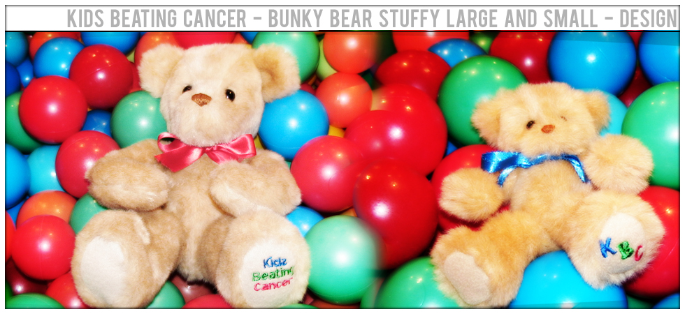
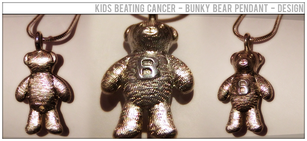
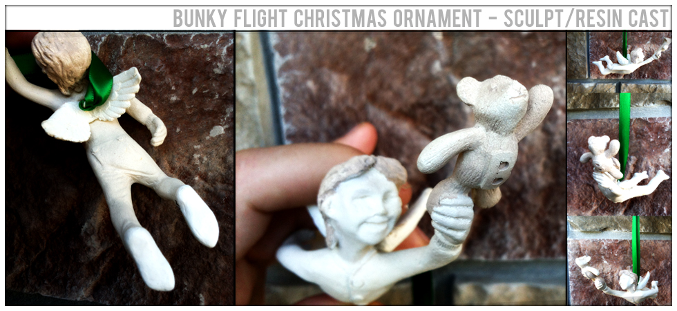
I worked with Kids Beating Cancer to design and construct their Bunky Bear. This bear was given away to children in hospitals so it had to be huggable. I think it was a huge success.
As a fund raising item this pendant was designed to keep with the theme of 'Bunky Bear'.
Inspired by the KBC Founders son, Jonathan and his bear Bunky. I designed an sculpted this work with a fellow artist and then produced the resin castings for a KBC Annual Event.
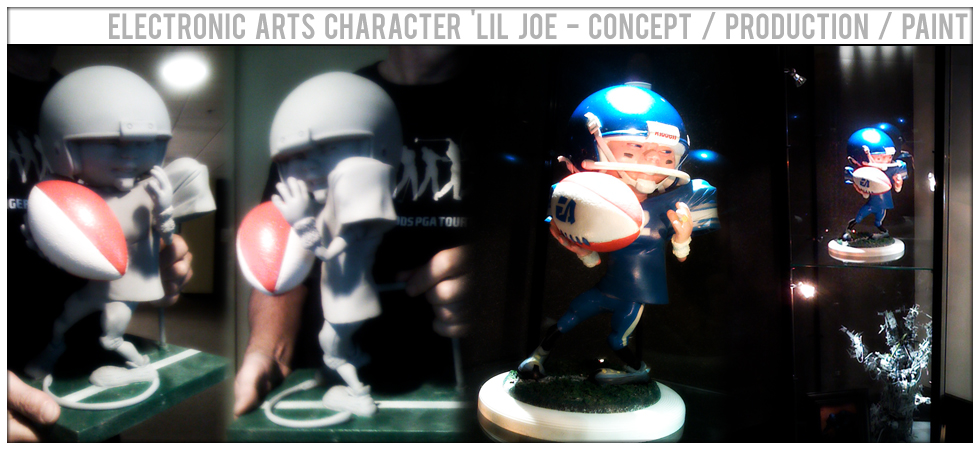
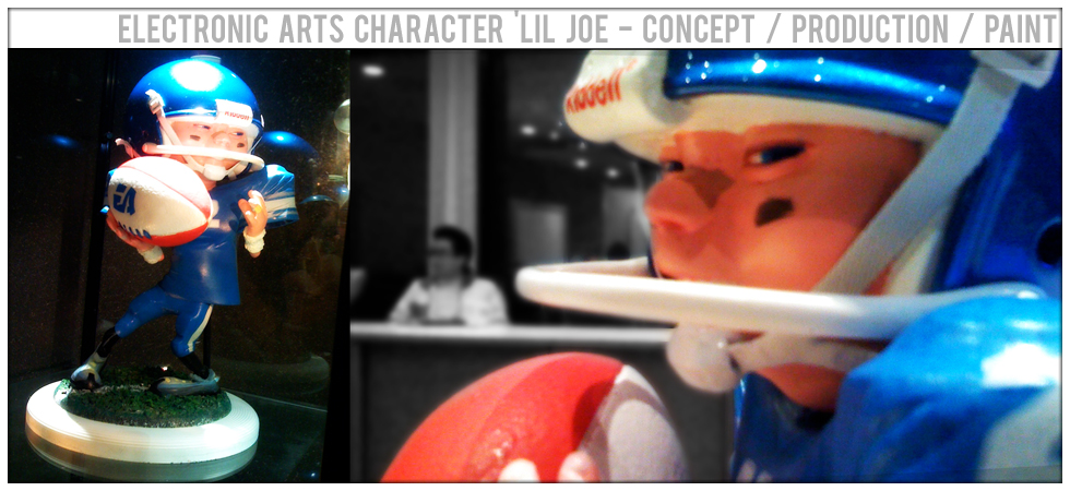
This was a collaborative project with a few artists to sculpt and produce a character for a game pitch. It involved a Sculpt, Mold Making, Casting and finishing including the painting of the finished model.
Several artists worked on this project with my role being in the mold making, casting and finishing of the final model from the original sculpt. My personal focus was on the football and the helmet.
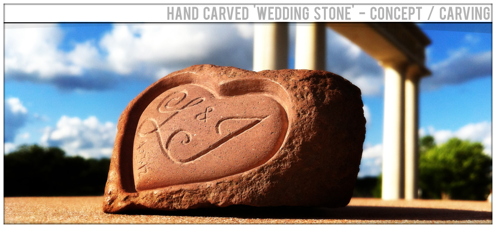
I hand carved this heart-stone for a friends wedding. I wanted something that would last their entire lives together - why not just carve it into stone. All done by hand using hand tools.
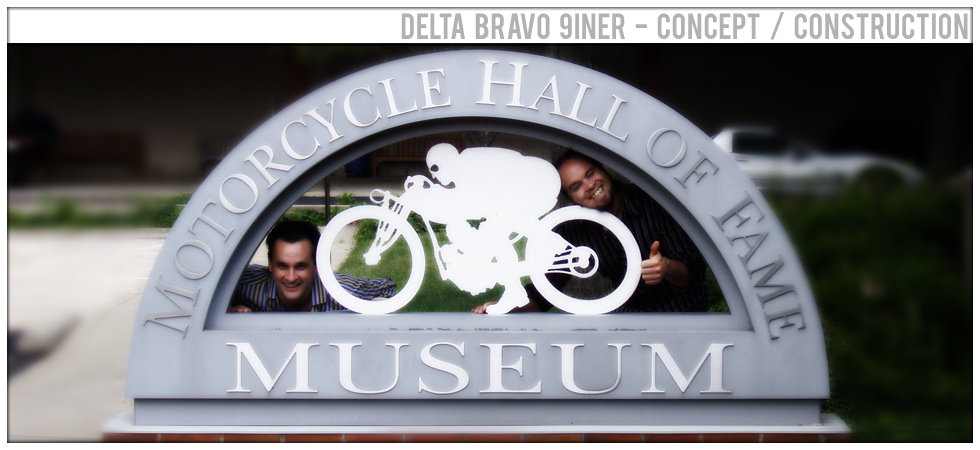
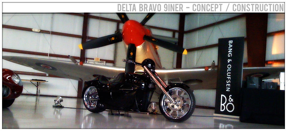
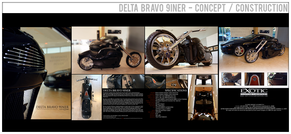
My business partner and I produced a motorcycle called Delta Bravo 9iner. This bike was placed on display in the Motorcycle Hall of Fame! This might be the highest level of recognition one can earn. It still makes me smile.
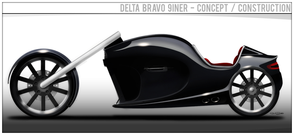
his is the original Concept Painting I did to sell the client on the bike's design. He loved it so we built it. Over 100 hand built 1 off parts got designed for this build. Including the revolutionary aluminum chassis.
The bike was designed to match the collectors Aston Martin road car. I distilled the 3 most important elements to the Aston Martin design language and made those the foundation for the bikes design.
Showing at some of the most upscale events in America, the Delta Bravo 9iner has been recognized, and awarded with the highest honors a bike like this can earn.
From the aluminum front grill to the hand stitched leather seat and crystal starter button sourced directly from a DB9 the bike sits pretty well next to it's inspiration - the Aston Martin DB9.
Showing at some of the most upscale events in America, the Delta Bravo 9iner has been recognized, and awarded with the highest honors a bike like this can earn. Being shown at the AMA Motorcycle Hall of Fame
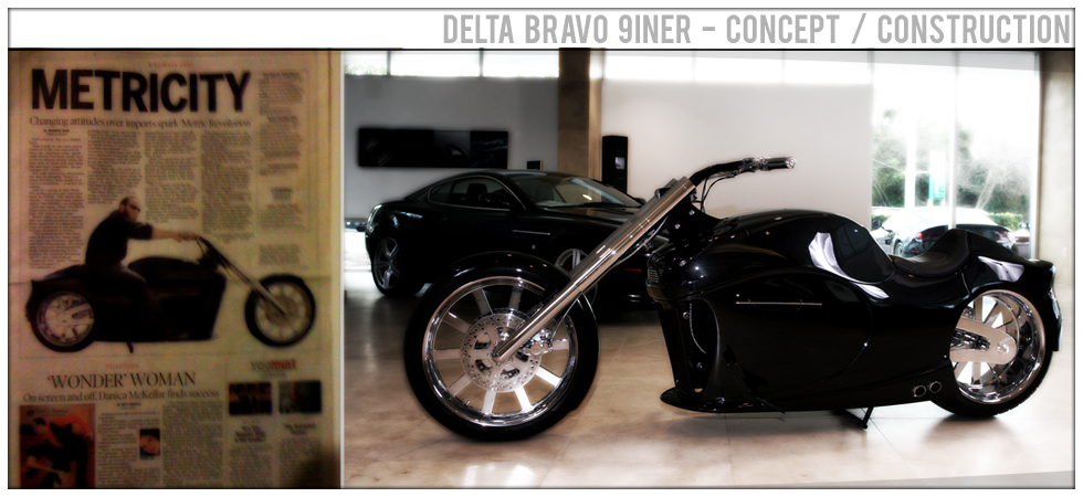
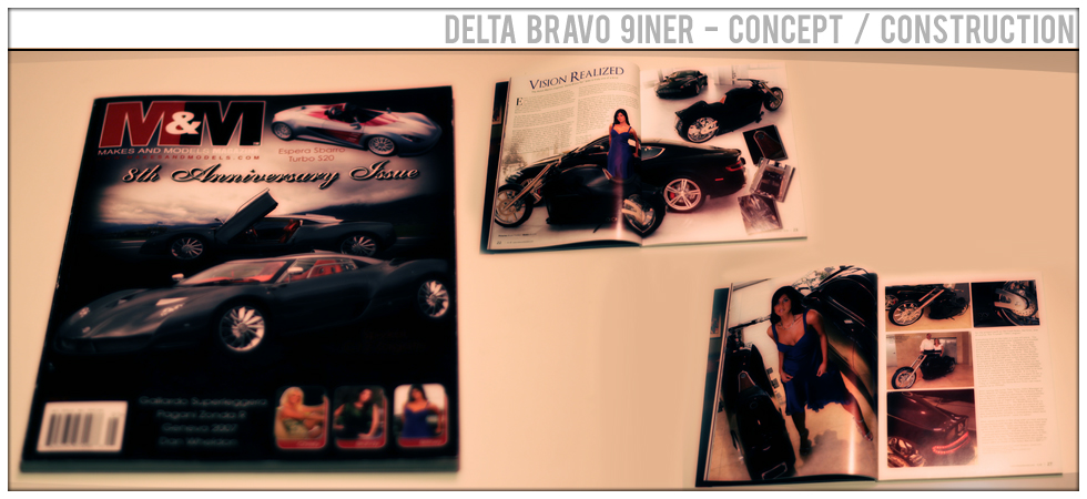
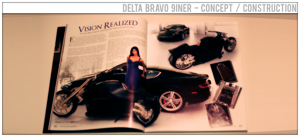
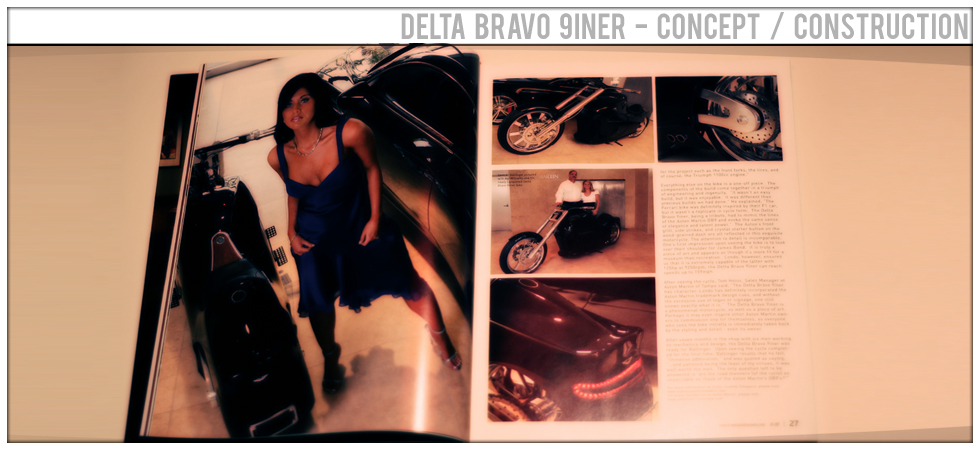
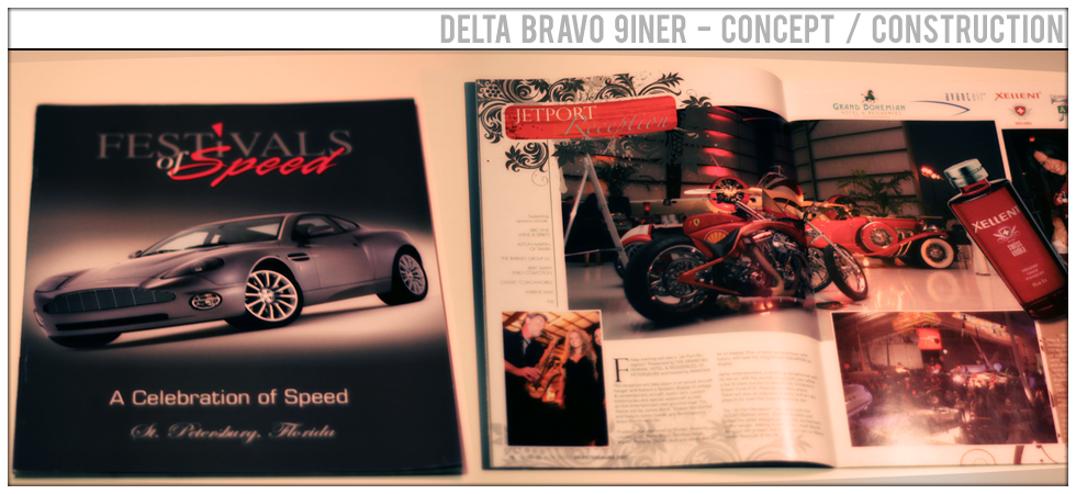
Delta Bravo 9iner has been published in magazines the world over. It's been seen by millions of readers and show attendees alike. It's so awesome to see my work in print like this. This is just one of 30+ international publications the bike made it into.
The project from concept painting to the photoshoot featured in these pages took 12 months. It was done in addition to my regular studio work and my commitment to the project saw much recognition.
The first time I rode this bike it was such an amazing experience. To dream something up on paper and then manifest it into reality is what my entire life is all about. I love it!!!
Two of our other bikes have also been noticed, and have seen print. Nothing beats walking into a Book Store and buying a magazine and finding your hard work featured within.
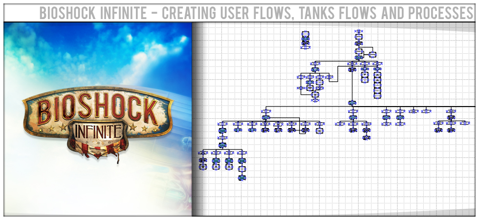
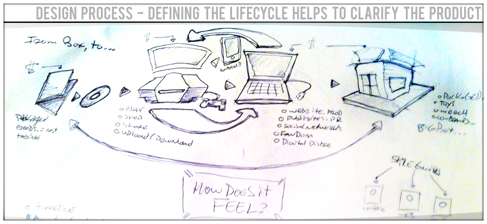
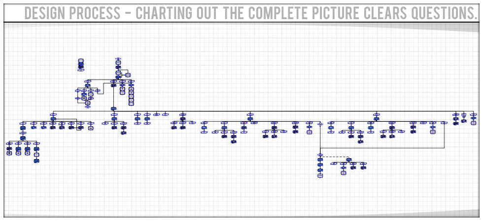
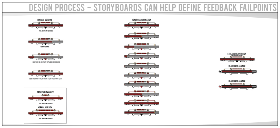
A good design starts on paper and ends up with Features, User Flows and Task Processes defined before you ever get to the finished design. Quality processes result in Quality products.
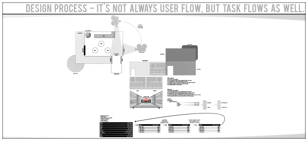
Anything a user can do is a 'task'. Task flows and processes are critical to understanding the path the user will take at anytime to perform the tasks required of them.
Completing a layout of the big picture helps to ensure that all features are understood, all tasks are defined and all data is accounted for. Big pictures are critical to projects.
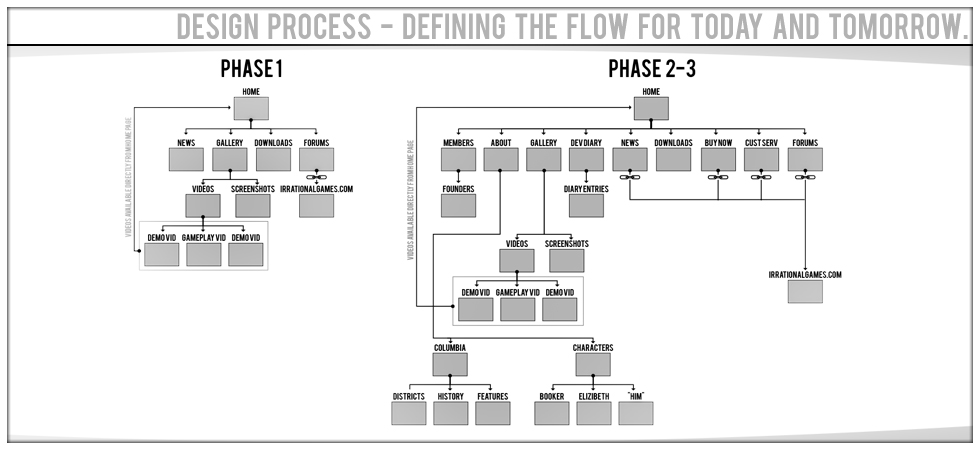
Laying out a clear plan for today and tomorrow allows you to account for the full lifecycle of a product. Planning ahead make things much easier in the future.
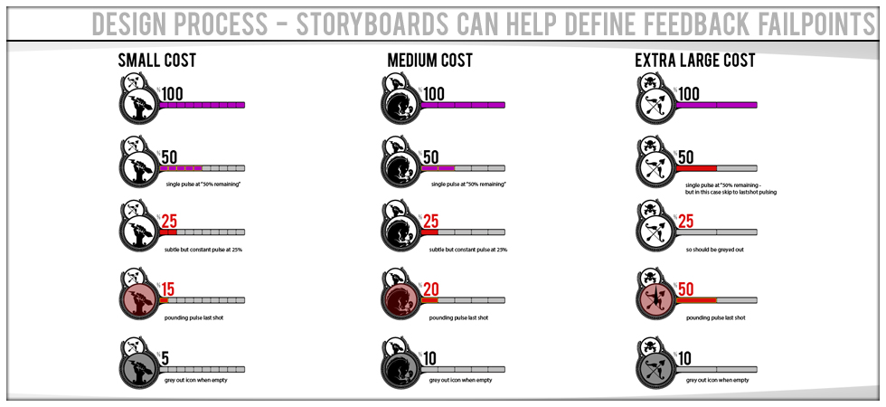
Good UX/UI is more than just about making sure the user understands what's happening, it's about making sure everyone involved understands the feature and how it works.
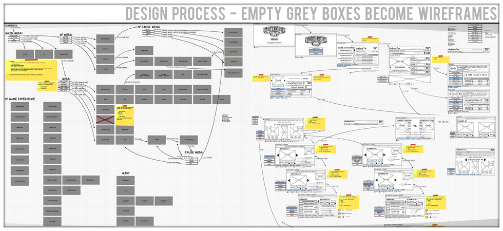
After laying out the feature map, each grey box starts getting replaced as the features come into the wireframe phase. This is just before we start concepting visual presentation.
I was a key part of the team that developed the product logo for the next installment of the award winning Bioshock. Developed by Irrational Games.
EA's Orlando based Sports Studio is called Tiburon - while I was there I was lucky enough to be charged with designing the new logo. The best part is this logo is entirely vector. It was so fun to render!
One of my respobsibilities while I was on the concept team at Tiburon was crafting logos for both shipping titles and brand pitches. This was a flexible logo language designed for GameShow.
I pulled together and managed a team of artists to design and build this logo for NCAA Football.
A new york based interactive company needed a snappy logo that was an extension of their current logo but spoke strongly to the interactive side of the company. We went on to animation the hell out of it!
Every company no matter how big or small needs a logo to start with, Action Paper Company wanted something simple and clean.
Born Sinner needed a logo that was young, bold and spoke loudly of fun. So I dropped this bomb on them and they loved it!
Allied Staffing wanted a logo that suggested the freedom that they wanted to give to their clients. The freedom to soar. The Leaf spoke to the strength, stability and roots of the company.
This web based educator wanted a logo that would stand the test of time and grow with them but was young enough that the students could relate to it.
One of the more fun logos to do and companies to work with. We went on to create some great marketing materials for them down the road leveraging this logo. Ask to see it sometime!
This logo was for a group that specializes in broadcast and media production. The logo spoke to their ability to deliver the content needed for the production of evening news. Delivering media by 3pm is their goal.
Linq came to me and asked me to launch their company for them. We went on to leverage this logo for three other sub-brands by using the flexible "interconnected" rings.